- 2.5: Design Principles and Heuristics
- 2.6 Mental Models and Representations
Lessons 2.5 Design Principles and Heuristics and 2.6 Mental Models and Representations
2.5: Design Principles and Heuristics
Introduction to Design Principles
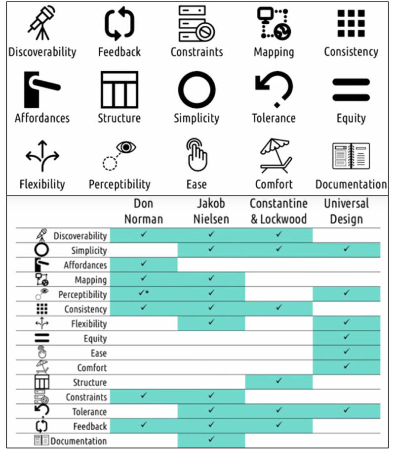
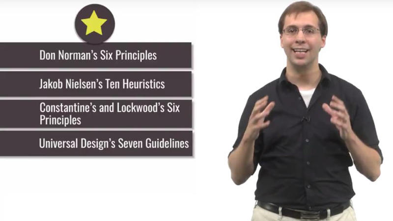
In this lesson, we will discuss 15 design principles and heuristics based on four sets of design principles:
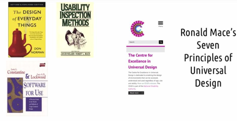
- Don Norman’s six principles of design.
- Larry Constantine and Lucy Lockwood’s principles of user interface design,
- Jacob Nielsen’s Ten Heuristics for user interface design (for both design and evaluation).
- Ronald Mace’s Seven principles called Principles of Universal Design.
Discoverability
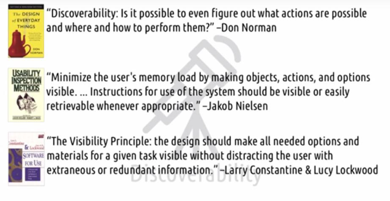
- Don Norman: is it possible to even figure out what actions are possible and where and how to perform them?
- Nielsen: minimizing the user’s memory load by making objects, actions, and options visible. Instructions should be visible or easily retrievable.
- Constantine and Lockwood [visibility principle]: making all needed options and materials visible without extraneous or redundant information.
The idea behind all three of these principles: Relevant function should be made visible, so the user can discover them easily.
Note: Discoverability is more at application level but not OS level (example: PPT and short-cut of screenshot commend on MacOS).
- quiz: ways to make hidden functions discoverable.
- An indicator of alternative ways to use the function while users using it.
- documentation and tutorial
Simplicity
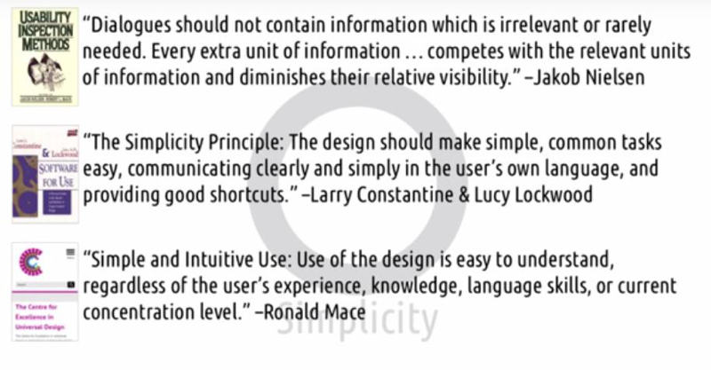
- Nielsen: (about dialogues) should not contain irrelevant or rarely needed information. because an extra unit of information competes with the relevant units of information and diminishes their relative visibility
- Constantine and Lockwood: the design should make simple common tasks easy. Communicating clearly and simply in the user’s own language and providing good shortcuts.
- Universal design: design should be easy to understand regardless of the user’s experience, knowledge, language skills, or current concentration level.
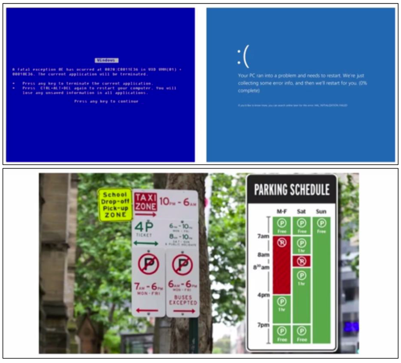
Example 1: Windows’ screen of death, only provide information the most the users care
Example 2: New York’s parking schedule singes
Affordances

- Don Norman: affordances mean that the design of a thing affords or hints at the way it’s supposed to be used.
- affordance is the relationship between the properties of an object and the capabilities of the agent that determine just how the object could possibly be used.
- We can also leverage metaphors or analogies to physical devices
- Signifiers (in context instructions) can be used to indicate the correct action.
Mapping
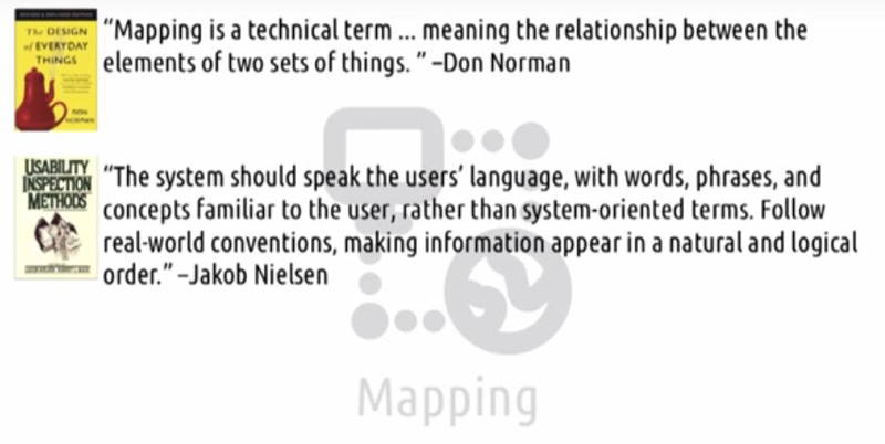
- Norman: Mapping means a relationship between the elements of two sets of things(the interface and the world).
- Nielsen: mapping means that the system should speak the users’ language, with words, phrases, and concepts that are familiar to the user, rather than system-oriented terms. Follow real-world conventions, making information appear in a natural and logical order.
- Nielsen’s heuristic describes the general goal,
- Norman’s principle describes one way to achieve it.
- Strong mappings help make information appear in natural and logical order.
Perceptibility
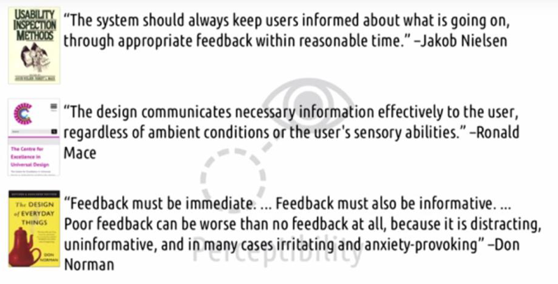
Perceptibility refers to the user’s ability to perceive the state of the system.
- Nielsen: the system should always keep users informed, through appropriate feedback within a reasonable time and allows the user to perceive what’s going on inside the system.
- Universal design: the design should communicate necessary information effectively to the user, regardless of ambient conditions or the user’s sensory abilities.
- Norman’s notion of feedback is very similar to the concept of perceptibility: feedback must be immediate, informative, and that poor feedback can be worse than no feedback at all.
Example of bad design with poor perceptibility: Ceiling fan
Consistency
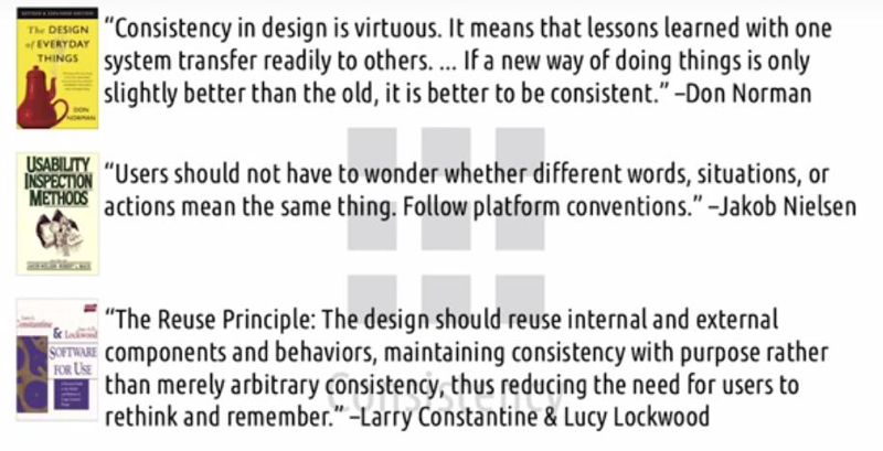
Consistency refers to using controls, using visualizations, using layouts, using anything we use in our interface design consistently, across both the interfaces that we design and what we design more broadly as a community.
- Norman: consistency in design is virtuous. lessons learned with one system transfer readily to others.
- Nielsen: users should not have to wonder whether different words, situations, or actions mean the same thing. Follow platform conventions.
- Constantine and Lockwood: consistency is reuse. The design should reuse internal and external components and behaviors, maintaining consistency with purpose rather than merely arbitrary consistency, thus reducing the need for users to rethink and remember.
- if we’re doing the same thing, it’s important to maintain consistency.
- In this way, we create affordances on our own.
Examples: Good ones: Links to web texts; Manu of software Bad one: Ctrl + Y
Flexibility
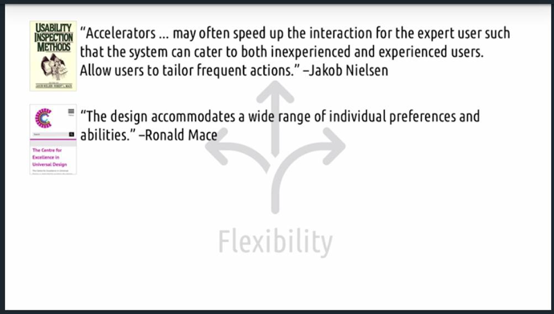
- Nielsen: providing accelerators(hotkeys) allows the system catering to both inexperienced and experienced users. We allow users to tailor frequent actions.
- Universal design: The design should accommodate a wide range of individual preferences and abilities.
- Dix et al: user customizability in supporting multiple designs for the same task.
Wherever possible, we should support the different interactions in which people engage naturally, rather than forcing them into one against their expertise or against their preference.
The principle of flexibility in some ways appears to clash with the principle of equity.
Equity
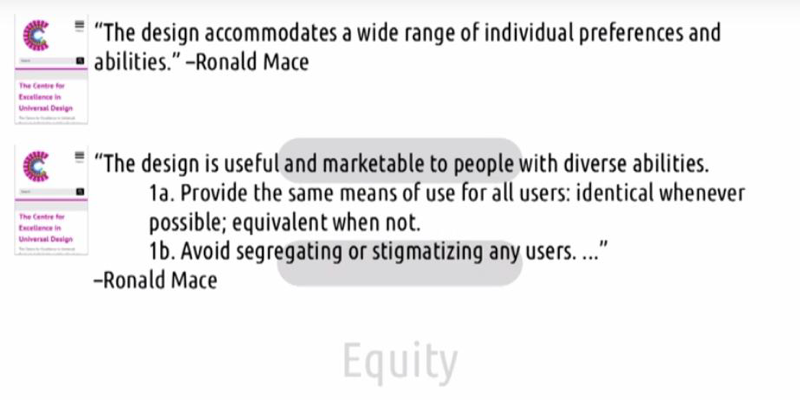
- Universal design:
- The design is useful and marketable to people with diverse abilities and should provide the same means for all users, identical whenever possible and equivalent when not.
- Avoid segregating or stigmatizing any users.
The important note: the experience is the same across all users.
Example: GT’s password reset. Everyone must follow the same rules when creating new passwords.
Ease and Comfort
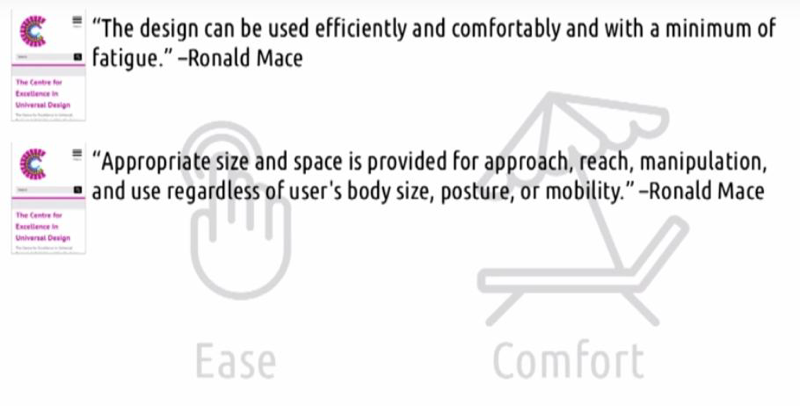
- Ease: the design can be used efficiently and comfortably and with a minimum amount of fatigue.
- Comfort: appropriate size and space is provided for approach, reach, manipulation and use regardless of the user’s body size, posture or mobility.
That’s an instance of HCI trying to improve user ease and comfort in a physical area.
Structure
The structure principle is concerned with the overall architecture of a user interface.
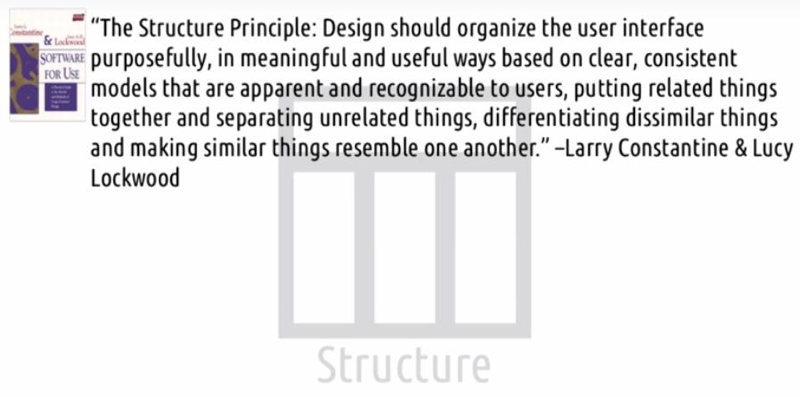
- Constantine and Lockwood: design should organize the user interface purposefully, in meaningful and useful ways based on clear, consistent models that are apparent and recognizable to users, putting related things together and separating unrelated things, differentiating dissimilar things and making similar things resemble one another.
We should organize our user interfaces in ways that help the user’s mental model match the actual content of the task.
Constraints
Constraints are about accounting for user errors or preventing the user from performing erroneously in the first place.
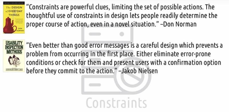
- Norman: the constraints are powerful clues, limiting the set of possible actions. The thoughtful use of Constraints in design lets people readily determine the proper course of action, even in a novel situation.
- Nielsen: Even better than good error messages is a careful design which prevents a problem from occurring in the first place. Either eliminate error-prone conditions or check for them and present users with a confirmation option before they commit to the action.
Both of these approaches refer to the need to stop faulty user input before it’s received.
Norman’s Four Types of Constraints:
- Physical constraints are those that are literally physically prevent you from performing the wrong action.
- Cultural constraints are those rules that are generally followed by different societies. In designing we might rely on these, but we should be careful of intercultural differences.
- Semantic constraints are inherent to the meaning of a situation.
- Logical constraints are things that are self-evident based on a situation, not just based on the design of something like a semantic constraint, but based on the situation at hand.
Tolerance
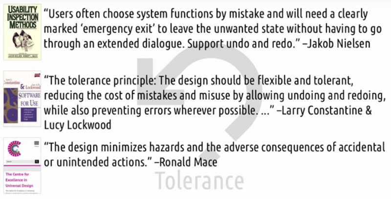
Tolerance (and feedback) deals with errors that do occur, it means that users shouldn’t be at risk of causing too much trouble accidentally.
- Nielsen: When users choose system functions by mistake, the design should provide a clearly marked emergency exit to leave the unwanted state. Support undo and redo.
- Constantine and Lockwood: the design should be flexible and tolerant, reducing the cost of mistakes and misuse by allowing undoing and redoing, while also preventing errors wherever possible.
- For Dix et al: this means recoverability. The system should tolerate users poking around with things.
- Universal Design: the design minimizes hazards and the adverse consequences of accidental or unintended actions.
Method: 1) constraining them away from making those mistakes, or 2) allowing an easy way to recover after those mistakes have been made.
Feedback
Feedback is another way to deal with user errors. Feedback let the users understand why the error happened and how to avoid it in the future.
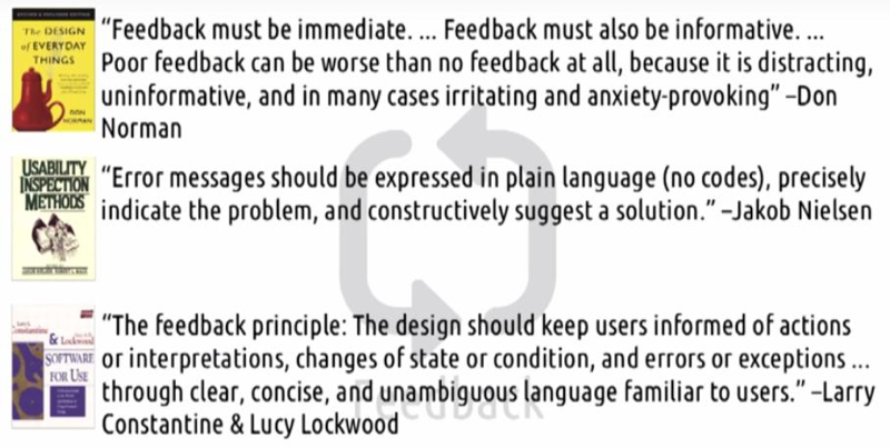
- Norman: Feedback must be immediate and it must be informative. Poor feedback can be worse than no feedback at all. Because it’s distracting, uninformative, and, in many cases, irritating and anxiety-provoking.
- Nielsen: error messages should be expressed in plain language (no codes), precisely indicate the problem, and constructively suggest a solution.
- Constantine and Lockwood: The design should keep users informed of actions or interpretations, changes of state or condition, and errors or exceptions… through clear, concise, and unambiguous language familiar to users.
feedback is more general, not just in response to errors. But here we’re most interested in feedback in response to errors.
Documentation
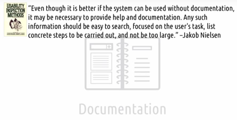
- Nielsen writes: even though it’s better if the system can be used without documentation, it may be necessary to provide help and documentation. Any such information should be easy to search, focused on user’s task, list concrete steps to be carried out, and not be too large.
Morden documentation is mostly online, organized by tasks and very easy to search and use.
Other sets of principles
- Dix, Finlay, Abowd, and Beale: 1) Learnability for how easily a user can grasp an interface, 2) Flexibility for how many ways an interface can be used, and 3) Robustness for how well an interface gives feedback and recovers from errors.
- Jill Gerhardt-Powels has a list of principles for cognitive engineering and especially at reducing cognitive load.
- Jeff Raskin: in <Human Interface,>
- Jim Foley and others:
give some principles that apply specifically to 2D and 3D computer graphics. - Susan Weinschenk and Dean Barker have a set of guidelines that provide an even more holistic view of interface design, including things like linguistic and cultural sensitivity, tempo and pace, and domain clarity.
Conclusion
2.6 Mental Models and Representations
Mental Models

- A mental model is a person’s understanding of the way something in the real world works.
- It’s an understanding of the processes, relationships, and connections in real systems.
- Using mental models we generate expectations (simulation) or predictions about the world and then we check whether the actual outcomes match our mental model.
- When reality doesn’t match with our mental model, it makes us uncomfortable and frustrates us.
- It can make us feel that we just don’t and never will understand (learned helpless).
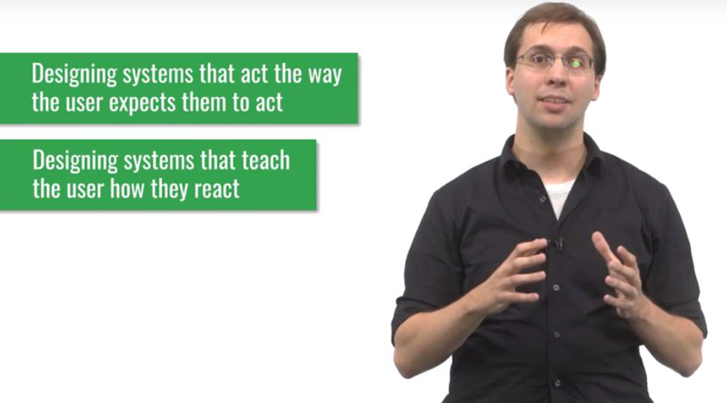
Two ways to make sure that the users mental model in our systems matches the reality:
- by designing systems that act the way people already expect them to act.
- by designing systems that, by their very nature, teach people how they’ll act. That way we can minimize the discomfort that comes from systems acting ways that users don’t expect.
Mental Models and Education
- Your goal is to teach your user how the system works through the design of your interface.
- You have to design interfaces that teach users while they’re using them.
- Good representations show the user exactly how the system actually works.
5 Tips: Mental Models for Learnable Interfaces

These principles of learnability were proposed by Dix, Finlay, Abowd, and Beale, in their book,
- predictability. Look at an action. Can the user predict what will happen?
- synthesizability: The user should also be able to see the sequence of actions that led to their current state.
- Familiarity (similar to affordances): the interface should leverage actions with which the user is already familiar from real-world experience.
- generalizability (Similar to familiarity and to Norman’s principle of consistency): knowledge of one user interface should generalize to others.
- consistency: This means that similar tasks or operations within a single interface, should behave the same way.
Using these principles can help the user leverage their existing mental models of other designs, as well as develop a mental model of your interface as quickly as possible.
Representations
- The most powerful tool in our arsenal to help ensure users have effective mental models of our systems is representation.
- Using good representations can make all the difference between effective and ineffective mental models.
Representations for Problem Solving
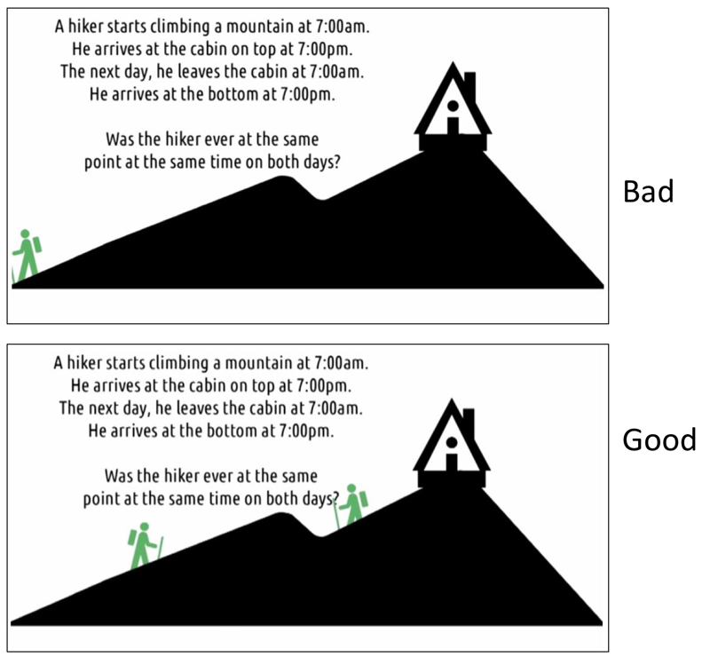
Good Representations can make the solution self-evident.
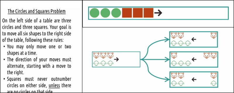
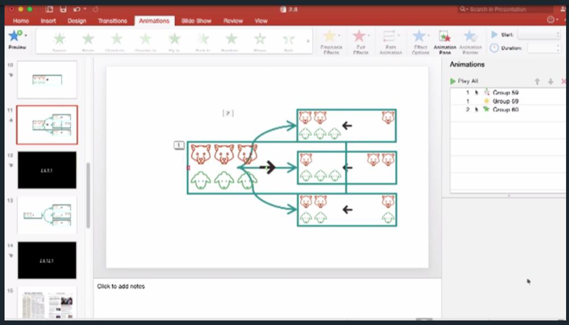
“Wolf and sheep” is a better representation of the problem then “Circles and Squares”.
The characteristics of a good representation are:
- good representations make relationships explicit. L
- good representations bring objects and relationships together.
- a good representation excludes extraneous details.
- good representations expose natural constraints.
Representations in Interfaces
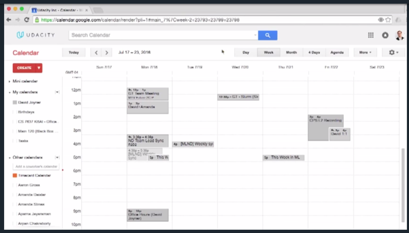
- representation of my week.
- it uses space to represent blocks of time.
- it allows me to quickly feel how long different things are going to take.
Metaphors and Analogies
- Analogies and metaphors are powerful tools which provide a solid foundation in teaching them how to use your interface.
- While analogies are powerful ways to help users understand our interfaces, we also need to pay special attention that what misconceptions they might introduce.
- Analogies make the interface more learnable but they also may restrict the interface to outdated requirements or constraints.
Design Principles Revisited
In our lesson on design principles, we touch on a number of principles that are relevant to these ideas of mental models, representations, and metaphors.
- the idea that people reason by analogy to pass interfaces, or by metaphors to the real world, is one of the reasons that the principle of consistency is so important.
- when we say that an interface should teach the user how the system works, we’re echoing the idea of affordances. Just by observing the system the, user should be learning how to interact with it.
- representations are important because they map the interface, to the task at hand. A good representation lets users predict the mapping between their actions in the interface and the outcomes out in the world.
New Functionality Meets Old Interfaces
Leveraging analogies to the real world or past interfaces can help the user to learn the new interface but we will be limited to do new things.
Learning Curves
A learning curve plots expertise against experience
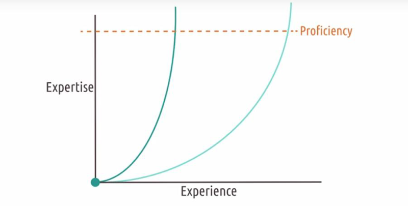
- Steep learning curve: easy to learn.
- Slow learning curve: hard to learn.
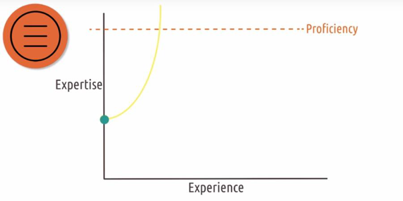
Analogies can help users to have a higher starting point in expertise.
User Error: Slips and Mistakes
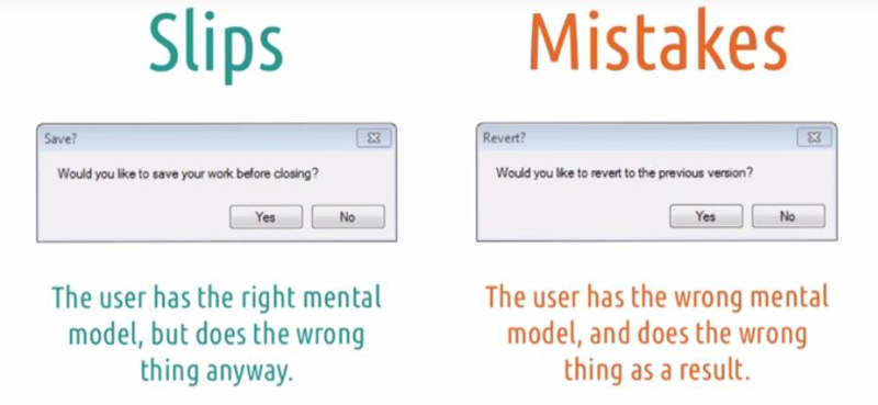
- Slips occur when the user has the right mental model but does the wrong thing anyway. (user knows what to do but did it wrong) Take this
- A mistake happens when the user has the wrong mental model and does the wrong thing as a result. (user doesn’t know what to do)
Types of Slips (Don Norman)
- Action-based slips: the user performs the wrong action, or performs a right action on the wrong object, even though they knew the correct action.
- A memory lapse slip occurs when the user forgets something they knew to do. (e.g. missing a step in the workflow).
Types of Mistakes
- Rule-based mistakes occur where the user correctly assesses the state of the world but makes the wrong decision based on it.
- Knowledge based mistakes occur where the user incorrectly assesses the state of the world in the first place.
- Memory lapse mistakes: similar to memory lapse slips, but focusing on forgetting to fully execute a plan.
- Leveraging consistent practices like designing dialogues the way users are used to.
- Offloading some of the demands on working memory from the user to the computer to avoid memory lapse errors.
- Leveraging good representations to help users develop the right mental of models to minimize these rule-based and knowledge-based errors.
- Leveraging the tolerance principle to make sure the repercussions can never be too bad.
Learned Helplessness
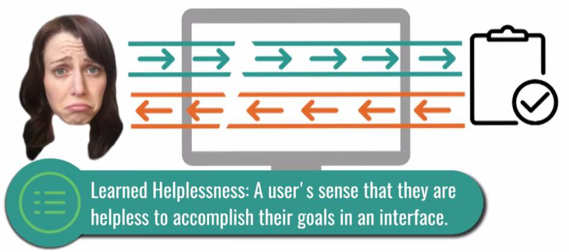
When the users feel that their input has no mapping to the system output, or they fell that they can not master or even use a system, they can fell very helpless.
Learned Helplessness and Education
In education, some students might refuse to be taught if they were convinced that whatever they do, nothing will change. one can not help those who don’t want to be helped.
Expert Blind Spot
- I am not my user
- I am not my user
- I AM NOT MY USER!
2018-06-18 初稿