- 2.3 Direct Manipulation
- 2.4 Human Abilities
- Sensation and Perception: Visual
- Sensation and Perception: Auditory
- Sensation and Perception: Haptic
- Design Challenge: Message Alerts
- Memory: Perceptual Store
- Quiz: Memory: Short Term and Chunking
- Long-term memory
- Cognition: Learning
- Cognition: Cognitive Load
- 5 Tips: Reducing Cognitive Load
- Motor System
OMS CS6750: Human-Computer Interaction – Summer 2018 笔记
Week 03: lessons 2.3 and 2.4 Human Abilities
2.3 Direct Manipulation
Introduction to Direct Manipulation and Invisible Interfaces
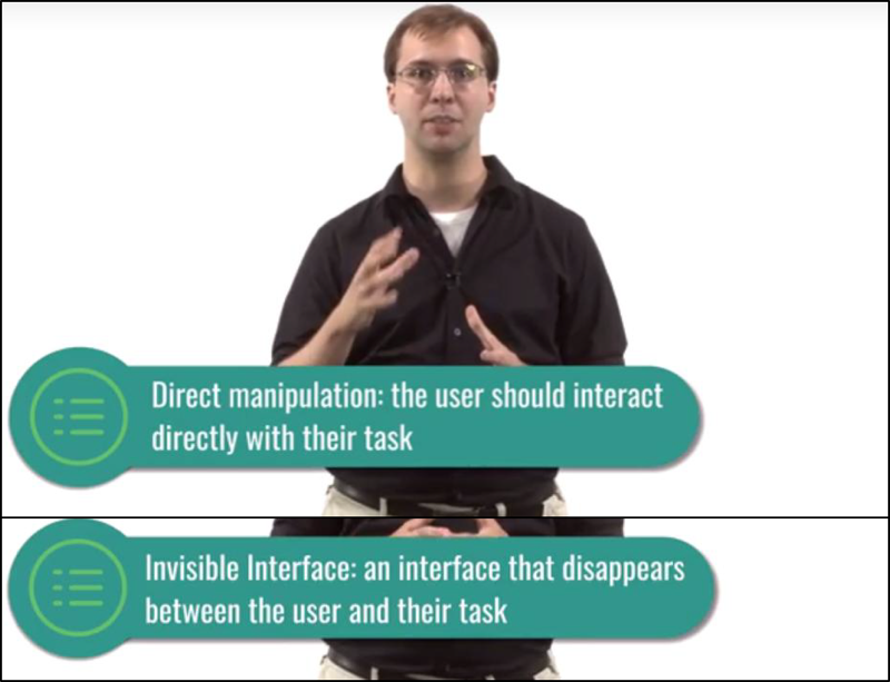
Direct manipulation and invisible interfaces are two applications of good feedback cycles.
- Direct manipulation: the user should feel as much as possible like they’re directly controlling the object of their task.
- At their best, the interface actually disappears
Direct Manipulation: The Desktop Metaphor
- Files and folders on my computer are meant to mimic files and folders on my physical desk.
- when using command-line, these actions were not direct at all.
- With GUI and mouse, now we can achieve the goal of direct manipulation of computer files and folders.
Paper Spotlight: “Direct Manipulation Interfaces”
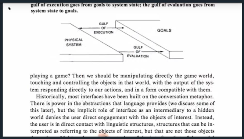
two aspects of directness:
- Distance is the distance between the users’ goals and the system itself.
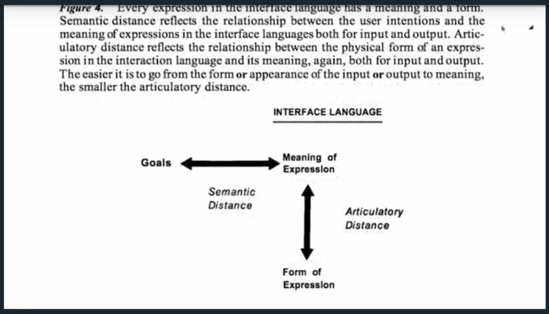
Semantic distance refers to the distance between the user’s goals and their expression in the system. Articulatory distance is the distance between expression and its execution.
- direct engagement
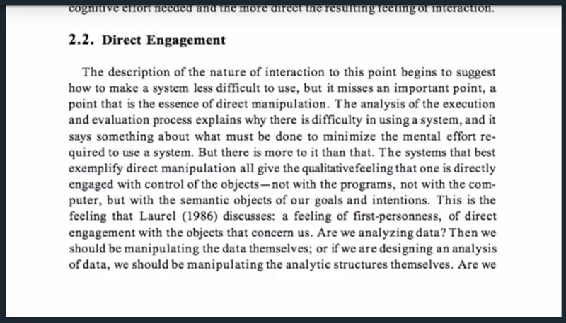
direct manipulation is a powerful method for shortening that distance.
Exploring HCI: Direct Manipulation
The virtual reality is allowing us to bring the principle of direct manipulation to tasks it hasn’t been able to touch before.
- designers are able to view what they’re designing in 3D
- They can rotate it around with the same hand motions you’d use to rotate a physical object.
- They can physically move around the object to get different angles on it.
But technology is replacing things you used to do manually, thus not using direct manipulation.
Quiz: Exercise: Direct Manipulation
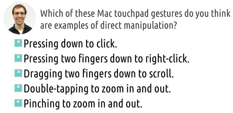
pressing down to click; scroll; pinching.. are the choices.
Making Indirect Manipulation direct
Example of the Mac touchpad.
Invisible Interface
- our ultimate goal is for the interface between the user and the task to become invisible.
- Good design. Interfaces that are metaphorically invisible
Invisibility by Learning
- With enough practice and experience, many users will become sufficiently comfortable with many interfaces to feel invisibly integrated into the task (e.g. Driving)
Invisibility by Design
- Our goal is to create interfaces that are invisible from the moment the user starts using them.
5 tips: Invisible Interfaces
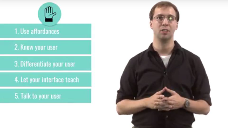
- use affordances.
- know your user. Invisibility to a novice means the interactions are all natural. But invisibility to an expert means maximizing efficiency.
- Differentiate your user. Provide multiple ways of accomplishing tasks.
- Let your interface teach. Ideally, the interface itself will do the teaching.
- Talk to your user. Ask them what they’re thinking while they use an interface. If users are talking about the interface, then it’s pretty visible.
2.4 Human Abilities
The lesson discusses the psychology of what humans can do.
- three systems. Input, processing, and output.
- Input is how stimuli are sent from the world and perceived inside the mind.
- Processing is cognition, how the brain stores, and reasons over the input it’s received.
- Output is how the brain then controls the individual’s actions out in the world
Sensation and Perception: Visual
- The center of eye: focusing closely on color or tracking movement.
- peripheral vision: good for detecting motion.
- colorblind: 1 in 12 men, 1 in 200 women
- visual acuity will decrease as aging.
Sensation and Perception: Auditory
- can discern noises based on both their pitch and their loudness.
- good at localizing sound
- is NOT directional
- Always on
Sensation and Perception: Haptic
- skin can feel things.
- things must touch right up against it.
- pressure, vibration, and temperature.
- always on but require physical touch.
Design Challenge: Message Alerts
Memory: Perceptual Store

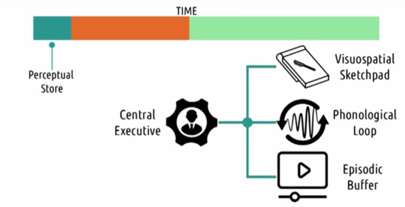
The perceptual store is a very short-term memory:
- visuospatial sketchpad which holds visual information for active manipulation
- phonological loop for verbal or auditory information
- The episodic buffer: integrating information from the other systems as well as chronological ordering
all three of these are coordinated by a central executive.
Expertise, or rehearsal, delays the decay of the perceptual buffer.
Quiz: Memory: Short Term and Chunking
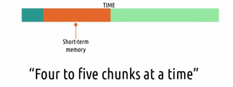
- users can really only store four to five chunks of information at a time
- it’s far easier to recognize something you know than to recall it independently.
Takeaways:
- we don’t want to ask the user to hold too much in memory at a time,
- ask the users to recognize, not recall.
Long-term memory

Long-term memory is a seemingly unlimited store of memories, but it’s harder to put something into long-term memory, than to put it into short-term memory
Cognition: Learning
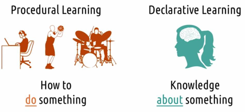
- Procedural is how to do something. It’s a task in which you’re engaged or an activity you are performing, it’s something that you do.
- Declarative learning is knowledge about something. It’s what you know in your head. It’s what you can answer when asked.
- while declarative knowledge is how we generally communicate with one another, procedural knowledge is generally what we do in HCI

You’re unconsciously competent with what you’re doing. When you’re in that state, it can be difficult to explain to someone who lacks that competence, because you aren’t sure what makes you so good at it.
Cognition: Cognitive Load
- Reduce the cognitive load posed by the interface, so that the users can focus on the task.
- understand the context of what else is competing for cognitive resources while users are using our interface
5 Tips: Reducing Cognitive Load
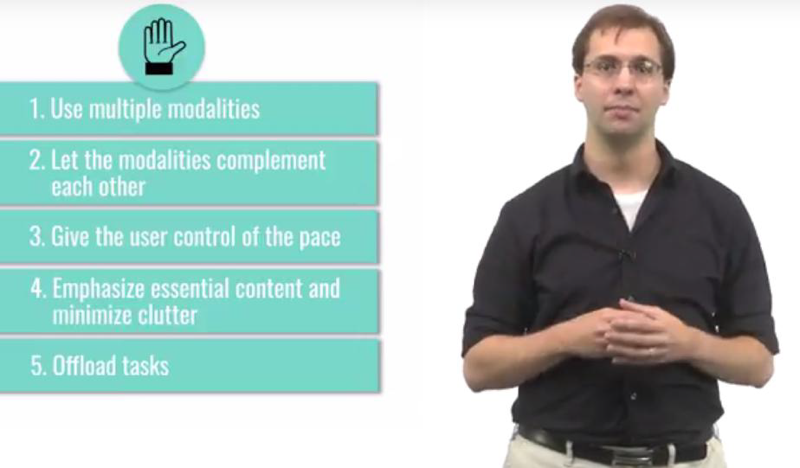
- use multiple modalities. describe things verbally and also present them visually.
- let the modalities complement each other.
- give the user control of the pace.
- emphasize essential content and minimize clutter. The principle of discoverability.
- offload tasks. try offload part of that task on to the interface.
Motor System
Speed, or precision of actions or movement. The goal of design here is to reduce the penalty for errors.
2018-06-18 初稿
